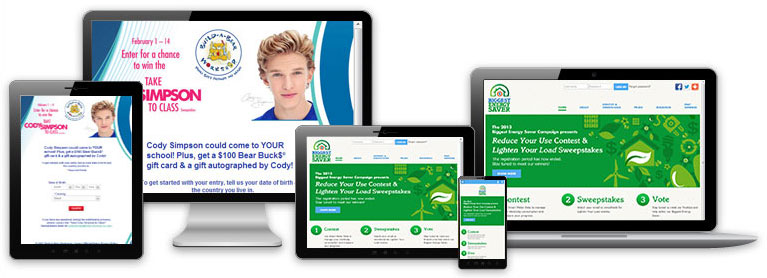
Since responsive web design is all about affecting the appearance of a website, viewing a site that uses it well will help tremendously in understanding it. To see an example, launch Microsoft’s website in a new maximized window in any recent browser on a desktop or laptop computer. Now resize the window and slowly decrease its width, and watch how the site adjusts as the viewable area decreases. Images get smaller but continue to scale correctly. The site layout generally becomes more vertical. Various elements are reorganized, are replaced by different versions built to fit in a narrower space, or in the case of a few non-critical items, disappear altogether. Even as the width decreases to the equivalent of viewing the site on a tablet or smart phone, the general theme is maintained, the layout stays tidy, information is never hidden, and none of the vital functionality is lost. While it’s only logical that there are still maximum and minimum widths that the site should be viewed at, it looks good and works correctly anywhere within that range.
Now that you’ve seen it in action, it should make sense if we define responsive web design as a way of building a web site so that it will display well – and by extension function properly – at virtually any resolution, in any reasonably current browser, and on almost any device, from a desktop PC to an iPad to an Android smart phone.
Responsive web design consists primarily of three major components: the fluid grid concept; the use of flexible images; and the incorporation of media queries.
What do we mean by a fluid grid? You’ve probably heard of HTML, or Hypertext Markup Language, which is the basic language that web sites are built in. Take a look back at the Microsoft site. Like any web site, all of the elements that make up the site – the images, text, menus, search form, and so on – actually exist within separate box-like HTML containers, and those containers are laid out on an invisible grid. In a properly built responsive site, as the viewable area changes size, the grid units resize and reflow along with it, and in turn those containers and their elements will continue to fit well within that grid no matter its current width.
Flexible images simply means that through the use of proper coding, the site’s images, backgrounds, and even objects such as video players will scale appropriately as their parent container changes dimensions.
Media queries are part of CSS, or Cascading Style Sheets, which is a language that’s used to control the look and layout of the numerous elements of a website. Media queries are used to detect the current width that the site is being viewed at and adjust various CSS accordingly. You can change an element’s width and height, its positioning on the page, hide and show entire elements, and much more. Through the use of media queries, you can completely change the way your site looks based on the width it’s currently being viewed at.
By now it’s likely clear that the main advantage of using responsive web design is that when browsing a properly built responsive site, users will have a consistent, high-quality experience, on almost any device, in almost any browser, and at any reasonable resolution. In addition, having a single responsive site means you only have to use, keep track of, and promote a single web address, and don’t need to worry about redirecting users to different sites based on the device they are using. And from a coder’s perspective, building a responsive website is going to require less time, maintenance, and organization than building multiple versions of a site that are designed for specific resolutions (although building and testing a responsive website will take more time than building a single non-responsive site).
The disadvantages are few. An especially elaborate design may not work well for a responsive site and certain elements may need to be scaled back or excluded for the sake of proper functionality. Responsive sites may load more slowly on mobile devices than a dedicated mobile site, although with proper coding the difference is typically not significant. And if you actually prefer your desktop, mobile, and tablet sites to each have their own unique looks, then a single responsive site is probably not the way to go.
Since its introduction just a few years ago, responsive web design has gained significant popularity, usage, and support – none other than Google now recommends its use – and we here at Marden-Kane have adopted it as our default method of building our client’s web sites. If you’re interested in creating a responsive site for an upcoming promotion, contact us and we can help.
To read more posts by Marden-Kane, please visit our main blog page or subscribe to our email list.